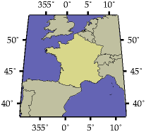
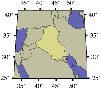
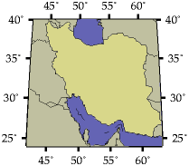
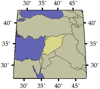
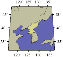
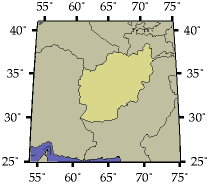
I shouldn't do cartography too often, but I see that various bits of the news media are still reporting that Iraq is `as large as' or `twice the size of' France. This is not the case. For your convenience, here are the comparitive sizes of some countries which are relevant to the new Empire: (maps are in the Mollweide equal-areas projection, and, unlike the CIA's can therefore be used to compare areas directly)
| Country | Area (km²) | Area (Frances) | Map |
|---|---|---|---|
| France | 547,030 | 1.000 |
 |
| Iraq | 437,072 | 0.800 |
 |
| Iran | 1,648,000 | 3.013 |
 |
| Syria | 185,180 | 0.339 |
 |
| North Korea | 120,540 | 0.220 |
 |
| Afghanistan | 647,500 | 1.184 |
 |
(Want to make your own maps? You'll need GMT and some ability with shell scripting. To start with, here is the script used to produce the above.)
Update
Paul points out that the correct journalistic unit of country size is, of course, a `Wales', equal to 20,779km²; Iraq weighs in at 21.03 Waleses. He also raises another interesting question: as we know, the proper journalistic units of length and height are such things as `a double-decker bus' (10m), `the height of Nelson's column' (56m), or `the distance from the Earth to the Moon' (400,000km). But what is the proper journalistic unit of width?