To comment on local political propaganda is pretty futile, but I was much amused by this figure from Anne Campbell Reports, the Labour Party's local freesheet, showing how Anne's electoral majority has changed over time:
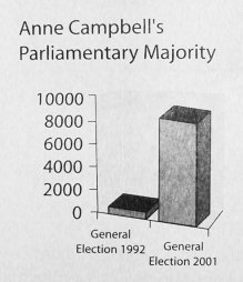
Ignore for the moment the tragic graphic design and offensive chartjunk for which, no doubt, Microsoft Excel is to blame. Concentrate instead on something which seems, unaccountably, to be missing from this plot. Something quite famous. Something that you might remember. Something that happened in 1997.
Let's see what a more honest version of the plot would look like:
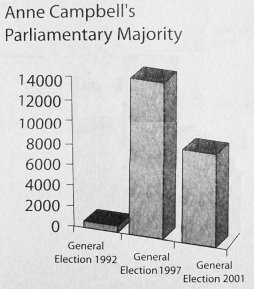
-- spot the difference?
(Obviously presenting the second of the above graphs -- showing support plummeting -- doesn't give the right spin for Labour election literature. Presumably the point here is that this edition of Anne Campbell Reports is the first that will be seen by this year's student intake. They may not know the history of Anne's promise to vote against top-up fees prior to the 1997 election -- a promise which she quickly forgot once the election was won, though oddly one which recurs in her propaganda now the deed is done -- and may not realise that her seat is by no means safe. It's just possible -- this is where somebody who cared more would insert some kind of rant about A-levels -- that the this year's new undergraduates aren't aware that there was an election in 1997, but I'd guess that's pretty unlikely. All told, this is a pretty clueless piece of propaganda.)
Of course, propagating charts like Anne's is just pandering to those who want us to believe that a British election is a process with only one degree of freedom. Here is a plot which shows things properly:
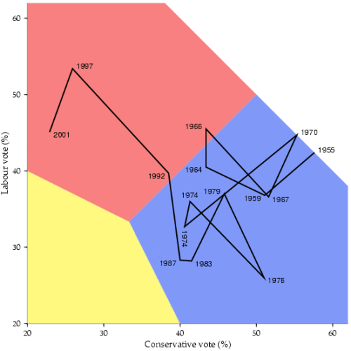
-- the point here being that we can regard the fractions of the vote for Labour, Conservative and Liberal Democrat candidates as summing to 1 (approximately) so two axes show exactly as much information as is available. It would be useful to show turnout too, but a three-dimensional version of the diagram would be rather harder to draw and more difficult to understand.
(All figures from Colin Rosenstiel's Cambridge City Election Results page.)