(This is a bit of a rant, and, sadly, it's about speed cameras again. Sorry. I'll write about something more interesting later.)
Since writing about speed cameras a little while ago, I've received a bunch of email from ageing boy-racers who are horrified that anybody would dare to question one of their great articles of faith: that speed cameras `cause accidents'. Chief among these have been the members of the `Unsigned Forms' mailing list -- an oddly named group of people who have the ambition to evade justice for any crimes they may commit by exploiting supposed procedural errors -- and Idris Francis, whose major rôle in life over the recent past -- apart from acting as a cautionary example to the `Unsigned Forms' mob -- appears to have been injecting a little seasonal ill-cheer into my life by emailing me ever-less-coherent (and poorly formatted) screeds about my previous article, accompanied by monumental `Word' documents setting out his `arguments' about speed cameras accompanied by poorly constructed graphs. (You can read his stuff by downloading this .zip file, though frankly I wouldn't bother, as it's all pretty feeble.)
Anyway, the basic point here is that a large set of anti-speed-camera people have mistaken a recent statistical fluctuation in data for road casualties for an `effect' of speed cameras; because they believe it to be a positive fluctuation, they immediately scream `speed cameras are bad', and have one or other crank pressure group issue press releases about it. (We can only speculate on what would have happened if these people had observed a negative statistical fluctuation at around the same time. If the experiment were practical, I would be willing to bet that they would not describe a negative fluctuation as a `success for speed cameras'.)
I get the impression that surprisingly many people, having seen the data presented by the ABD, are convinced by the theory. Typically they write something like (paraphrasing)
I agree that the analysis is subjective, but if you can't accept that something went terribly wrong after 1993, it's obvious that you don't know what you're talking about.
For those whose minds are slightly less closed, let's see if we can't kill this stupid theory dead once and for all.
The way to do this is to formulate the theory in terms of a hypothesis which can be tested, then test it.
The hypothesis is that, up to 1993, there was a falling `trend' in road casualties; and after 1993, this `trend' slowed. 1993 is important here because it was the year in which speed cameras were first introduced. (It was also -- coincidentally -- the year when the amount of traffic on the roads began rapidly to increase after a hiatus during the recession of the early 1990s. Make of this what you will. In any case to do this properly the analyst would have to show that 1993 was a significant year; but here we're only testing previous claims, so we skip that step.)
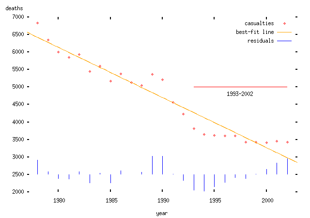
Clearly, the number of road casualties in any given year is the result of a random process. By saying that there is a `trend', we are claiming that the number of deaths in a given year is given by some smooth function which changes slightly year-on-year -- the trend -- plus some random variable, a `residual'. Here are some possible models:
Linear trend: we assume that the mean number of deaths in any given year is some constant fewer than the mean number in the preceding year. Obviously this model is wrong at some point, since the number of deaths must be positive or zero; but for a short interval this may be a valid model:
Exponential model: we assume that the mean number of deaths in any given year is some constant fraction less than the mean number in the preceding year. This has the nice property that it can never be negative.
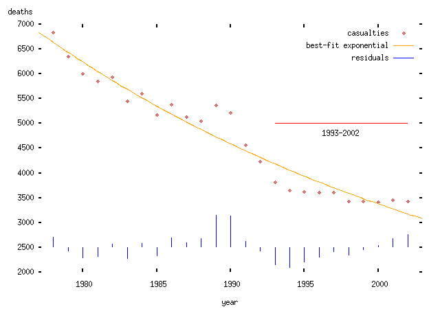
(Note that I haven't justified why there should be a downward trend or why it should be linear or exponential. If I wanted to make some kind of positive prediction, I would need to do so; in particular, I would need a model of why this should happen. But I don't need to do that here, since I'm interested in analysing somebody else's claim, which itself assumes a particular trend. To do anything useful with this kind of trend, you really need a theory which explains why there should be a trend and what form it takes. There's also the issue of how you find the trend. In the ABD's case, they appear to have chosen the trend line which is most favourable to their theory; in the plots above I have used the conventional procedure: to find the best fitting curve or line using a least-squares procedure. The two models fit about equally well, but that's not really relevant since we haven't explained why we would expect such a trend in the first place. I should say that I do believe that there is a trend -- but I can't explain exactly why there is a trend. I expect that it relates to increasing road and vehicle safety, though there are other possibilities.)
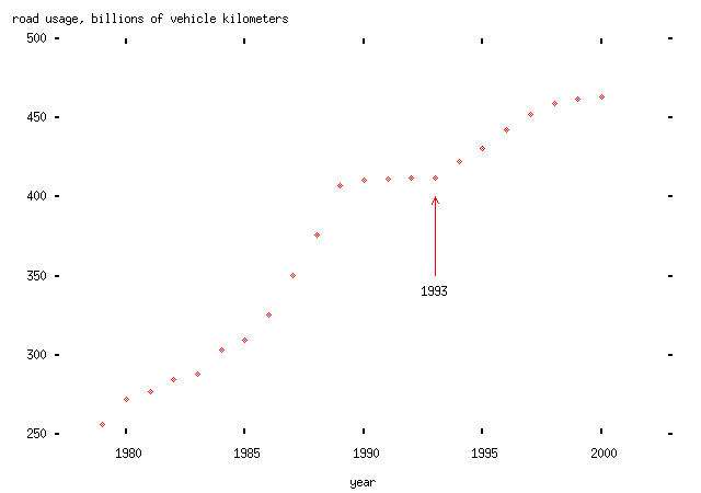
Another theory which is also popular, and which I'm also not going to try to justify, is that road casualties depend linearly on the amount of road traffic -- measured in vehicle kilometers, so that two movements of one kilometer by different vehicles counts the same as one movement of two kilometers by one vehicle -- and fall according to some trend. (This theory is obviously partly sensible -- increasing road usage will, presumably, lead to more accidents -- but the assertion about linear dependence would need to be tested for this theory to be very useful. In particular, a nonlinear dependence would be easier to justify, since motorists often crash into one another rather than into stationary objects, and the rate at which that occurred would presumably depend upon the square of the number of vehicle kilometers driven.)
Anyway, here's the rate of road usage in vehicle kilometers on Britain's roads from 1993 to 2000 (note the increase starting after 1993):
... and here's the plot of deaths per vehicle kilometer driven with an exponentially-falling trend:
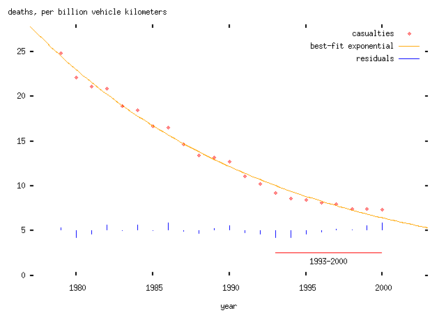
(Superficially, I'll remark that this looks pretty good. But that doesn't necessarily mean anything much.)
Now we want to ask whether these `trends' changed after 1993. We can't do this just by looking at the plots, because a pattern that appears to be obvious to the eye might just be coincidental. Instead, we need to do some kind of formal test to find out whether the `trend' has changed.
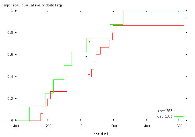
If the trend had indeed changed, the residuals after 1993 would be distributed differently from those before 1993. Either the variance -- i.e., the spread -- of the residuals would increase; or, more interestingly, the mean of the residuals would change. In English, that means that the trend would consistently under- or overestimate the actual number of deaths. (The anti-speed-camera people would like to say that the trend has underestimated the number of deaths, and interpret this as evidence that some change -- speed cameras -- `caused' the extra deaths.)
A standard technique to answer this question is a Kolmogorov-Smirnov test (like everything in statistics, it's named after its inventors); this test can be used to tell us whether two sets of samples -- in this case, the pre- and post-1993 residuals from the various models -- are either (a) drawn from different distributions; or (b) are consistent with having been drawn from the same distribution. The idea of this test is that we take the two cumulative distributions and plot them on the same axes, and then find the furthest distance between the two curves. This maximum distance (called the `Kolmogorov-Smirnov test statistic') can then be compared to a critical value which tells us whether the two sets of samples were drawn from different distributions or not. (Surprisingly enough given my description, this is actually formally correct and backed up by all sorts of hideous maths.) Here's an illustration with the residuals for the exponential case above:
Pleasingly, those nice people at the R Project have implemented software which will do almost all of the work for us. So:
| Model | K-S statistic | p-value | Conclusion |
|---|---|---|---|
| linear, total deaths | 0.1806 | 0.9718 | same distribution |
| exponential, total deaths | 0.3403 | 0.4059 | same distribution |
| exponential, deaths per vehicle kilometer | 0.1714 | 0.9943 | same distribution |
-- that is, in each case, there is no evidence that the trend is any worse a fit after 1993 than before. None of these data support the hypothesis that there was a change in trend in road casualties in 1993, measured either in total or per vehicle kilometer.
This doesn't, of course, tell us anything new about speed cameras, or whether they are good or bad for safety. It tells us that one argument used against them -- by the ABD, and Idris Francis and other assorted loons from the `Safe Speed' campaign -- is bollocks. (As are most of their other arguments, but this post is already too long; the other arguments are mostly handwaving anyway, and can be dismissed without needing to resort to anything like the above, either because they are nonsense or because there isn't any data to confirm them. Another day, perhaps, if these bozos irritate me any more.) This doesn't stop them repeating the same lie, for instance on The World At One on 30th December last year, when the ABD's Mark Macarthur-Christie said,
According to the work we've done, if the road accident trend before 1993, when `Speed Kills' and cameras became the... the major tool of road enforcement... if that pre-1993 trend had continued to date, we'd have around 5,500 fewer people dead.
As above, this is not true; and there's precious little evidence that the ABD's error was an honest mistake. (And, as ever, the BBC -- typically innumerate -- let it pass without comment, as did other interviewees. I emailed World at One, concluding,
Although most of the statistics used in the speed cameras debate are pretty suspect, the ABD's stuff is the worst of the lot. I was saddened that the program repeated their claim without any dissenting voice pointing out that it was rubbish.
-- no response, naturally.)
(Update: I've corrected a typo in the above table. The third column is the p-value of the test, not the critical value. This doesn't change the conclusions. None of the results show a significant change in distributions.)
Over at `Safe Speed', things aren't much better. Particularly hilarious is this collection of graphs of casualty statistics; as ever, these people would do well to read Tufte. But the graphic design isn't the main problem. Consider the graph of annual change in the number of deaths (referred to, charmingly, as `fatals' -- say what you mean, people!) per billion vehicle kilometers. Now, generally, differencing a series like the casualty data is going to give very noisy results, since the random fluctuations are large by comparison with any background trend. So the `Safe Speed' people have decided to plot a moving average of the data too. Well, sort of:
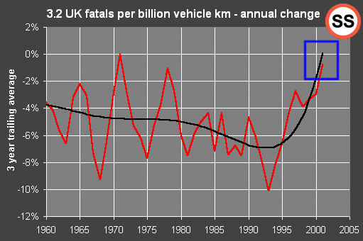
Note -- blue box to right of plot -- how these people have, unaccountably, managed to average three quantities and get a result which is larger than any of those quantities. How remarkable that this -- frankly, bizarre -- error should yield the result they are trying to prove -- namely, that road casualties are rising or soon will start to rise. (It would be politic to engage `surprise mode' in response to this stunning coincidence.) Oddly enough they've manage to make the very same error in about half of their `annual change' plots -- always in their favour....
(Update: Paul Smith of `Safe Speed' now appears to be claiming that the black curve is not in fact a moving average, but simply a made-up polynomial that is put on the graph to create the impression that there is a stationary long-term trend in accidents per vehicle kilometer. He gives no justification for the form of the curve; the point is just to make things look Really Bad. Again, to do this properly, the analyst should be using some procedure to filter the data in a window; like a correctly-applied moving average, such a procedure would not yield trend values outside the range of the real data values. A pretty poor effort either way.)
So, basically, where the arguments used by the anti-speed-camera people touch on actual data, they're crap and/or dishonest. The anti-speed-camera campaigners are liars, and innumerate too. They don't understand how to write emails, won't accept criticism, and they spend too much time in the company of Microsoft `Word'. What's not to dislike?
Idiots.