Skimming That OECD Report on the British economy (which happens to contain a section about higher education funding to warm the heart of Tony Blair), I found an interesting plot which is almost a good summary of the debate on the government's top-up fees proposals. With a tiny modification, it is. I can't be bothered to re-plot this in a less ugly form, so here's an amended version of the OECD's diagram:
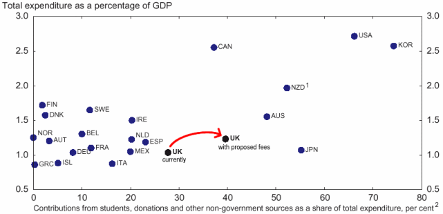
This plots the fraction of GDP countries spend on higher education against the fraction of higher education expenditure which comes from things other than general taxation. Note that the very highest-spending countries (the United States and South Korea) have very high levels of student contributions; the lowest-spending ones (Greece, Italy, ...) have low levels of student contributions. Note also that the UK presently has relatively low levels of funding, and relatively high levels of student contributions.
What the OECD don't show on their plot -- and what I've added above -- is the effect of the proposed reforms. The report says that these will `generate' (i.e. extract) about 0.2% of GDP from students for higher education funding (this is based on an assumption about how universities set their fees which is noted in the OECD report). Measuring the figures from the plot (these are approximate, of course) this gives the following before-and-after table:
| Conditions | Total funding (% of GDP) | Contribution fraction (% of total) |
|---|---|---|
| current |
1.03 0.285 fees, 0.745 tax |
27.7 |
| proposed |
1.23 0.485 fees, 0.745 tax |
39.4 |
This makes an interesting comparison with the other countries in the plot.
(As an aside, I should say that there's one important thing missing here, which is consideration of the numbers of students receiving higher education. That's for another day, I think.)